Welldoc brand refresh
Creative Direction | Art Direction | Content Strategy
Video and script by Slate of Mind. I provided creative direction.
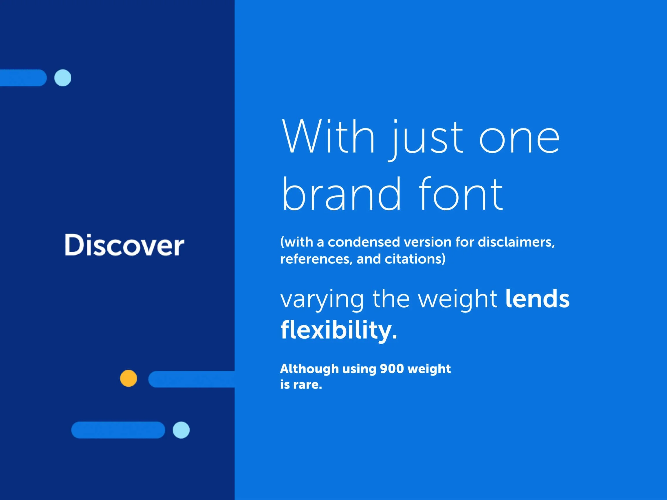
Welldoc, a digital health company, needed a brand refresh, a way to unify its existing logo to a broader identity system, and a stronger, more cohesive point of view on photography. The company was in a state of evolution as it transitioned from its child-product, BlueStar, to its eponymous product, the Welldoc App. This would make its brand identity even more important to both B2B buyers and users of the product.

We didn’t work in a vacuum.
Partnering with Cross-Functional Colleagues
The brand and marketing team led a cross-functional branding workshop with our clinical, product, and innovation team. I led this workshop over the course of two-days, in-office, with Welldoc’s VP of Client Success, Senior Director of Clinical Services, and VP of Market Solutions with the marketing team.
After the brandbook was completed, the design team partnered with Welldoc’s data science team to put together the first data visualization style guide. Welldoc is a data driven organization that compiles monthly reports to its B2B customers, so establishing a set of best practices was paramount. I led and managed this effort, with a focus on establishing guidelines around which Welldoc could tell a story with data.

Evangelizing the brand
I gave two presentations during company all-hands meetings. The first covered the updated brandbook. The second presentation went through the data visualization style guide. The latter presentation was given by our data science team, the lead designer on the project, and me.
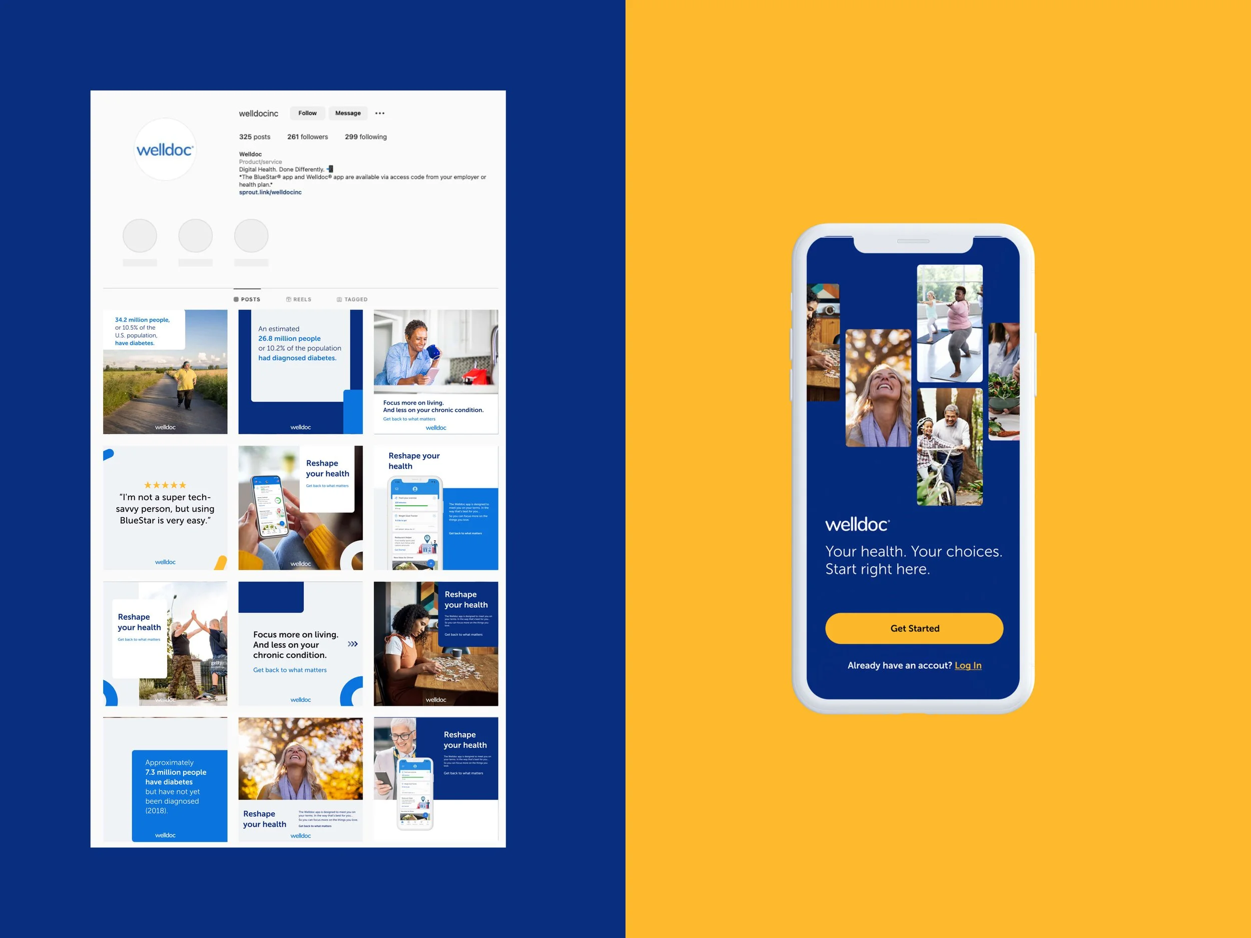
Welldoc is a B2B2C company, so the parent Welldoc brand needs to effectively stir the same feeling in both corporate settings and with individuals. Below are samples of how the visual identity system can come through in both kinds of pieces.

on stock photography
most healthcare companies use the same stock models. welldoc was no different.
Why? There are an enormous number of places in which branded, visual content lives. And photos of software UI are not compelling when you are selling to real human beings. Real people resonate the best in an industry that maintains, at best, its humanity. There was not a budget for hiring a photographer for a custom shoot. Why not use illustrations? Again, budgetary constraints and practicality. To the latter point, Welldoc white labels its software (and, consequentially, white labels its marketing materials). Carrying over a custom illustration style is not practical in a white label context because it would require partners to develop their own bespoke illustrations.
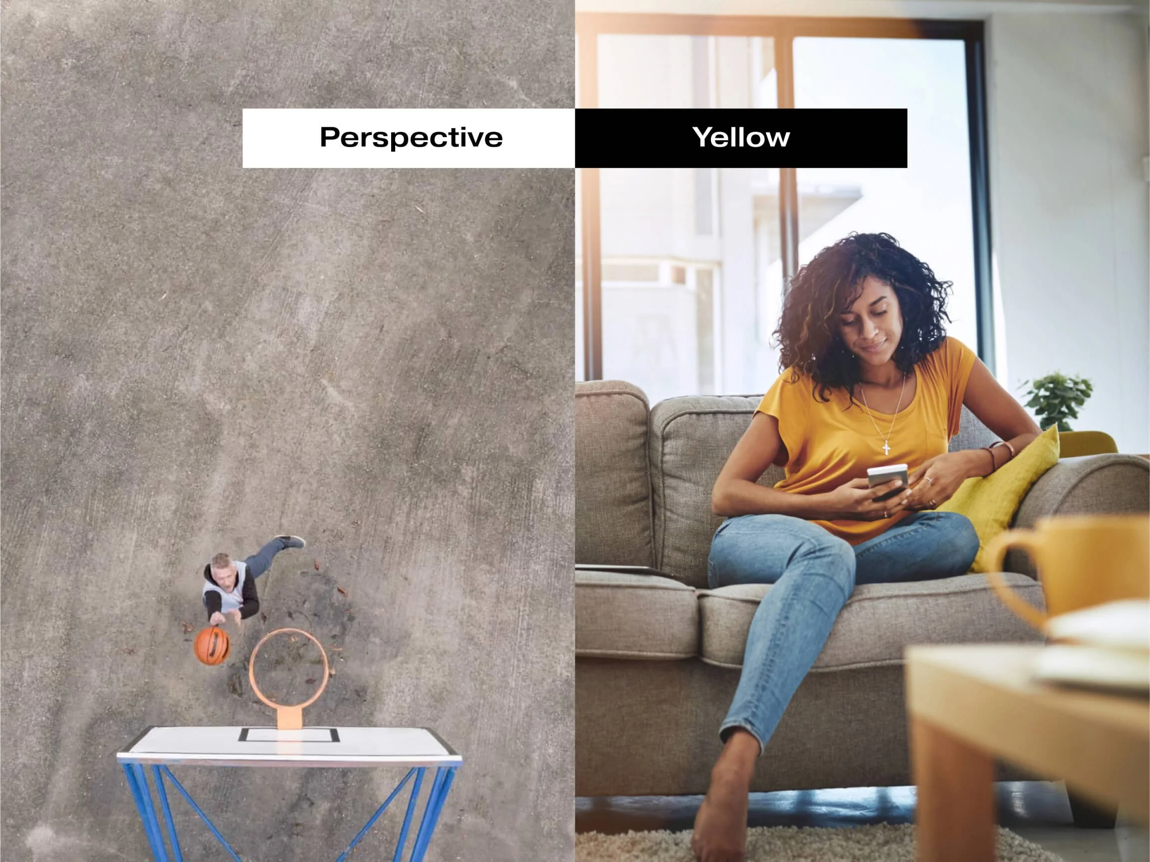
How did Welldoc decide to stand out? By embracing the concept of new perspectives, partnerships, and yellow.
All core photography should capture either a new perspective or allude to partnership in some way. That, or, the brand’s secondary color needs to be a clear accent in the piece. As in, it should come through in the photography.


One of the best parts of this project was forging a closer relationship between the brand and marketing design team and Welldoc’s product design team. In a perfect world, these groups work in lock step. But in a fast-moving company, things can get siloed. The brandbook that I led became the source of truth on both our product, as seen in the welcome screen, and across the marketing team, as seen in the social media templates on the right. I art directed the social templates project, and senior designer Lyudmil Iliev created each design. Welldoc’s lead Product Designer Adam Palmer designed the screen on the right.

Creative Team
Mark Slater, Slate of Mind (video script, video production), Brooke Latour (Graphic Designer), Lyudmil Iliev (Senior Designer)
